Colour is pretty simple, right? I can hear all the designers, printers and anyone out there involved in managing brand consistency shifting uncomfortably in their seats.
Managing colour can be a minefield for the uninitiated, especially when the goal is a consistent appearance for your brand. Why does our brand blue look luminous on my laptop? Why is it tinting aqua on this report? The unfortunate (but also exciting) truth is colour is not as simple as it appeared on Sesame Street.
Colour is one of the most important brand recognition tools, with a recent study by the University of Loyola, Maryland finding the correct use of colour could increase brand recognition by up to 80%. We would be wary of trusting a Westpac homepage that looked orange, and would think twice about washing our clothes with Cold Power from a purple box. Our kids would ask questions if their Elmo doll was maroon. As weird as these scenarios sound, they are very possible without the right level of colour management.
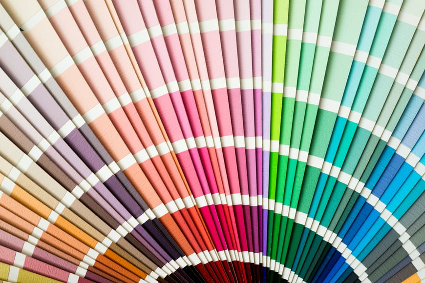
This sort of colour trouble is happening more and more in modern branding, and this is because brands need to appear in more and more places. And these different places all shave different ways and rules for represeting colour. Your iphone works with colour differently to a digital billboard, and your business card will take a different approach to an ad in a newspaper. You’d know that printing mixes inks like CMYK to create colours, and digital screens use RGB to combine light to create colours. But, inside each of those spectrums exist many different colour profiles that all have their own ways (and limitations) or colour replication.
These profiles can have a drastic impact on how your brand’s colour is interpreted, and ultimately how it is viewed by your audience. And it gets even scarier when you realise that not every profile can replicate every colour. For context, it’s estimated that there are up to 18 decillion colours in existence (that’s 18 followed by 33 zeros) and our eyes can differentiate up to 10 million different tones (also up for grabs depending on who you talk to). Out of all those possibilities, digital based RBG can create over 16 million, while printed CMYK can create just over 16,000 colours.
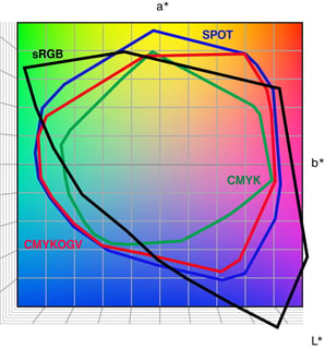
The chart above compares colour space limitations, you can see how much of the RGB spectrum is just not compatible with CMYK. And how much of our visible spectrum is not even covered by RGB.
Now remember all those different profiles within each spectrum I mentioned? They are limited by the device outputting your colour. For example, your newspaper ad will be printed, so it needs to speak in CMYK to the printer, but uses a unique profile of CMYK set up specifically for the absorbent paper which limits the colour possibilities. Your TV ad needs to speak in RGB and uses a very specific version RGB which televisions understand, which also means it can’t replicate all the 16 million RGB colours. Each of these examples have colour spaces that are far more limited than what is possible in the parent colour spectrums. The learning here is if your brand colour exists outside of the CMYK space, it will appear different in the newspaper to the screen.
So, when every output defines your brand colour differently, how does a brand achieve consistency? The actual answer is refreshingly simple: Once you understand the basics of colour, you can decide the right approach for your brand.
You can choose a colour that exists in all colour spaces. But that might feel limiting, as a lot of those colours are not as exciting or bright in a progressive digital world.
For some brands, different is absolutely cool. They might have a mostly digital presence, so print is not a concern. AGL is an example of this, where bright, digital-only shades of blue are a big part of their palette. Doctors.com.au, featured in the newsletter that led you here, also uses this approach. Their world is digital, and the colour choices reflect that.
This video we created for AGL shows the bright, vibrant colour that digital spaces make possible.
The most common approach is one that a lot of brands use, measured difference. This means there are predictable differences between their colour applications. Print might feel a little duller and digital applications a shade or two brighter. It’s not enough for most to notice, but enough to make the most of the different colour spectrums.
This is an approach we took for Yarra Valley Water, who after a rebrand that was keen to move into a more digital led, modern palette that felt fresh and pure. The pure RGB blue and green looked amazing on screens, but existed a long way outside of the CMYK space. For a brand where printed bills were received by over 70% of their audience, they couldn’t ignore the huge gap in colour. We helped them adjust to a middle ground that felt connected from screen to print, and still channeled the brand’s need for freshness and vigour.


Yarra Valley Water's brand colour adjustments allowed for measured consistency across a huge range of colour applications.
Each of these solutions can (and should) delve deeper into the complicated depths of different profiles, spaces and devices for exact colour values. But without that big picture understanding of colour and decision on what is right for the brand, those complexities are likely to cause confusion.
So, in answer to that first question we posed: Colour is far from simple, but with a little knowledge and the right plan it can be more predictable, and controllable. The trick is doing the work, testing and finding the right combinations that give your customer a managed experience that feels simple as they traverse brand touchpoints.

Caino (no-one at Hive calls him Michael) leads our creative team with over 17 years of communications and design experience accumulated across many different industries. From toy design to advertising and everything in between, Caino has thrived in solving varied visual and communicative problems for many leading brands and their customers.
